I am proud to present my new website!
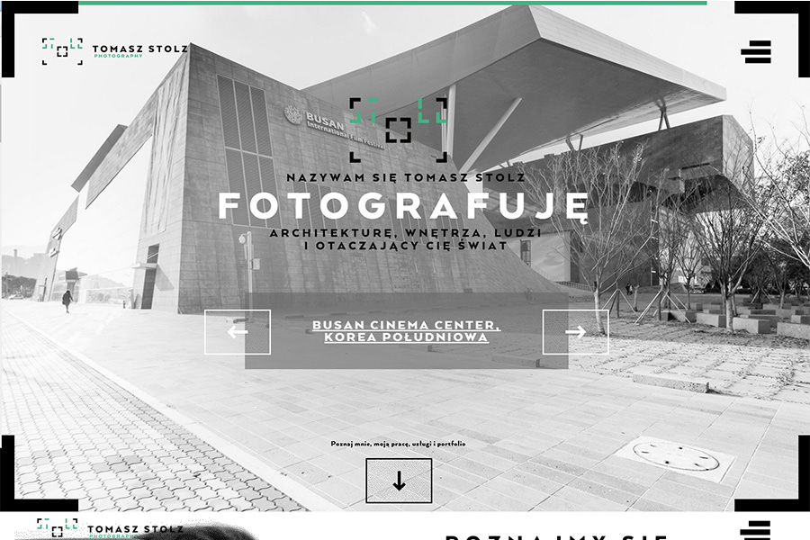
Tomasz Stolz Photography’s website presents strong references to the harmony of the company’s emblem. The main idea on which the design is based was the use of 3:2 format. Images and shapes seen here keep these proportion when presented in different sizes. Simple geometric figures based on a square create the minimalist feel. The foreground is taken, however by the play on image and typography in a relaxed yet clear form. The large typeface is presented as a heading right on top of the images. The colour scheme consists of three main hues: Black, white and green (from the logo). The added neon blue is supposed to break the simplicity of the colour scheme and its purpose is to highlight interactive and important elements. The whole website, including the images (apart from the ones in the portfolio) is based on gradient maps carefully chosen to match the original artwork. This colour combination emphasizes the company’s image. Minimalism, large photographs and typography as well as ‘made to measure’ style – a brief description of Tomasz Stolz Photography’s website.